

Layers of Light for Calm, Elegant Rooms
Today we explore layered lighting plans that elevate calm, elegant rooms, bringing together ambient, task, and accent illumination so every surface feels intentional and serene. With thoughtful dimming, color temperature harmony, and mindful placement, you can create spaces that invite slower breathing, quieter conversations, and a refined, enduring sense of comfort.
Begin with a Gentle Ambient Base
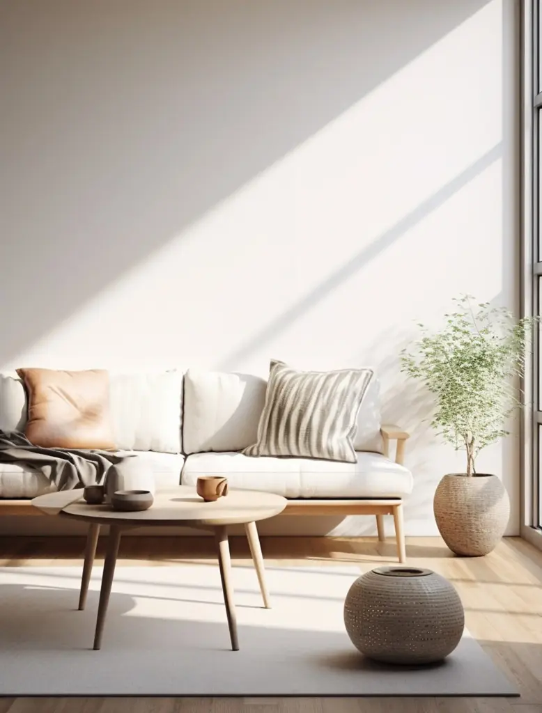
A graceful foundation starts with ambient light that smooths contrast and lets your eyes rest. Think balanced, indirect illumination that softens corners, reduces glare, and pairs with matte surfaces to diffuse reflections. Target comfortable residential levels, avoid harsh hotspots, and use layered dimming to modulate mood from early-morning clarity to evening hush without ever flattening character or drowning detail.
Ceiling Height, Output, and Evenness
Let architecture guide output. Taller ceilings often welcome uplight coves or softly shielded pendants that spread illumination evenly. Aim for comfortable ambient targets around 100–150 lux, balancing uniformity with subtle shadow for depth. Keep glare below eye level, use wide beam spreads where appropriate, and design multiple circuits so transitions feel smooth, never abrupt or fatiguing.
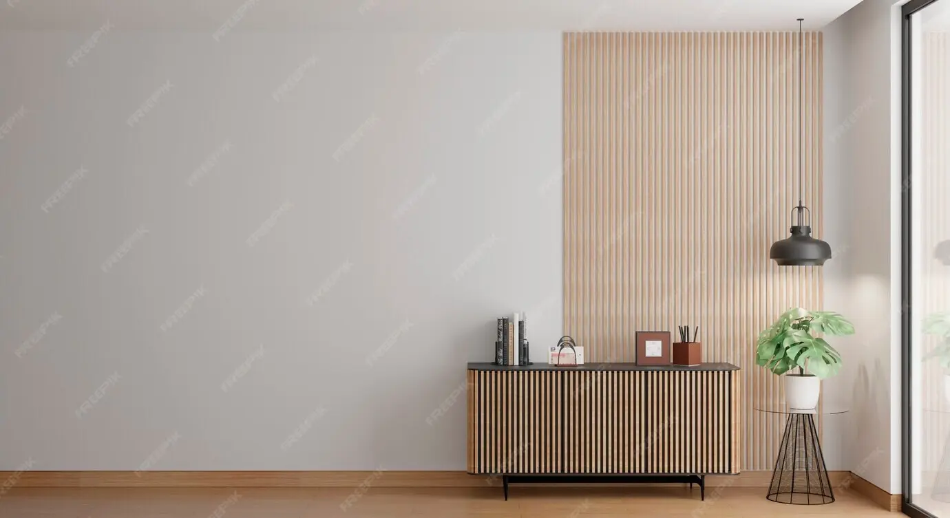
Bouncing Light for Softer Rooms
Indirect strategies calm a space. Wash ceilings or upper walls to bounce light back down through soft reflectance, turning the entire room into a quiet lantern. Choose lighter paint values to improve efficiency, employ lensing to hide diodes, and avoid shiny surfaces that create sparkly distractions. The result is volume illuminated without hard edges, encouraging lingering and conversation.
Dimmers, Zones, and Daily Rhythm
Create zones that respect how rooms truly live. Dim the perimeter for evening coziness, brighten the center to host games or reading, and gently taper transitions between areas. Pair dim-to-warm sources with quiet drivers to reduce flicker, and set scenes aligned to morning focus, afternoon productivity, and nighttime calm. The room then breathes naturally with your day.
Task Light that Settles the Mind

Reading Nooks with Glare Control
A perfect reading corner needs light landing on pages, not in eyes. Position adjustable arms behind the shoulder, tilt shades to conceal the source, and aim for around 300–500 lux at the surface. Choose warm 2700–3000K for evening sessions, prioritize high CRI for accurate print contrast, and add a low-level ambient glow nearby so the nook feels inviting rather than isolated.
Kitchen Prep with Crisp Precision
Under-cabinet lighting eliminates shadows from upper boxes, revealing textures and knife edges with welcome confidence. Use continuous, high-CRI 90+ LED strips, 3000K for balanced warmth, and diffusers to prevent diode scalloping. Combine with a dimmable island pendant for layered control. When dinner is plated, gently lower levels and let the table glow, turning productivity into comfortable ceremony.
Home Office Calm and Focus
Task light should complement screens, not compete. Position diffuse sources beside monitors to relieve contrast, add a focused desk lamp for documents, and keep color temperature consistent to avoid visual jitter. Consider indirect uplight to buoy the ceiling plane, reduce eye strain with low-glare optics, and save a warm, low scene for late-night planning that feels unhurried and centered.
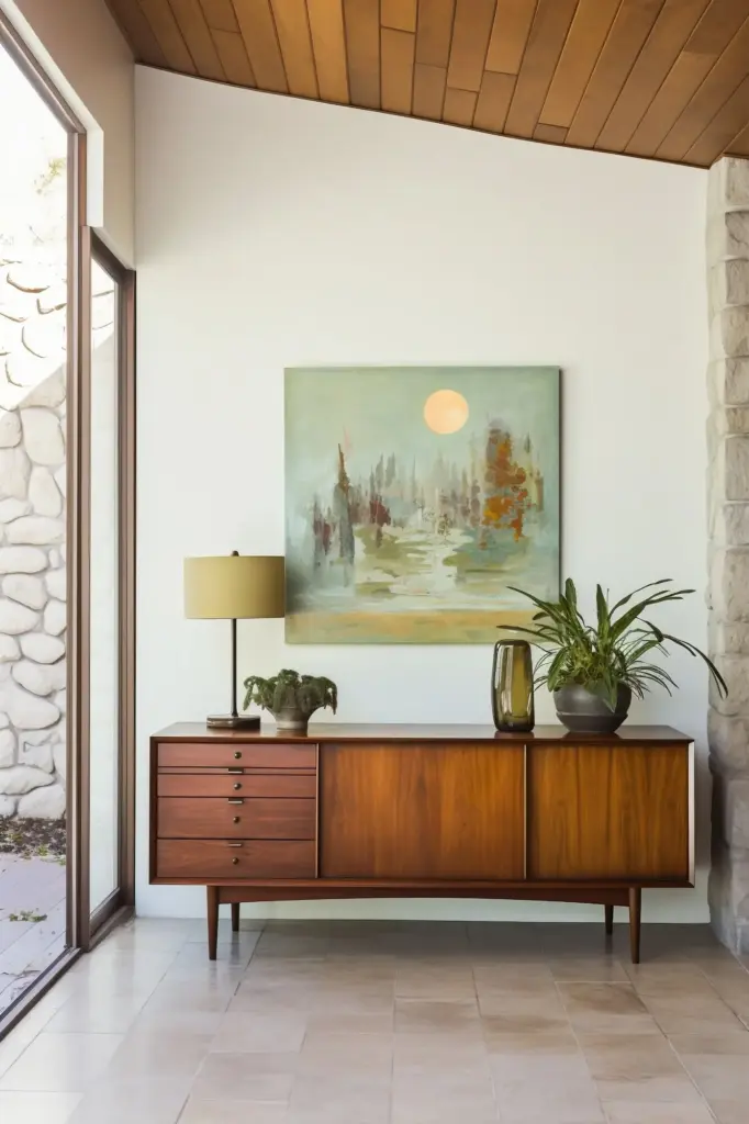
Art-Safe Illumination and Angles
Protect pieces with high-CRI, low-UV LEDs and considered beam control. A common starting angle near thirty degrees reduces glare and keeps frames from casting harsh shadows. Warm, consistent color assures skin tones and pigments feel natural. Keep brightness below surrounding glare thresholds, layer a faint wall wash for context, and let the artwork breathe rather than blaze aggressively.

Texture, Grazing, and Gentle Drama
Ribbed plaster, brick, or carved wood invite grazing from close-set fixtures with narrow beams, creating light and shadow that feel tactile. Place luminaires carefully to avoid scallops, dim generously to prevent harsh contrast, and coordinate color temperature with the room. The goal is a hush of depth that rewards touch and sight, never a theatrical blast that overwhelms serenity.

Color Temperature, CRI, and Harmony
Color decisions steer emotion. Warm tones cultivate intimacy; slightly cooler tones support attention. Keep correlated color temperature consistent across sources so spaces feel cohesive, and prioritize high color rendering for materials like stone, wood, and textiles. When layers harmonize, rooms appear effortlessly refined, balancing clarity and comfort without visual jitter or the sensation of mismatched, competing illuminations.
Planning the Layers: A Room-by-Room Story
Turn strategy into narrative. Sketch how mornings, afternoons, and evenings unfold, then script each layer to support that rhythm. Map circuits, choose optical distributions, and set scenes that make ordinary routines feel ceremonial. The resulting choreography transforms lighting into a gentle host, cueing rest, focus, or celebration without drawing attention away from your company or your craft.
Sustainable, Subtle, and Future-Proof
Calm elegance respects resources. Favor durable fixtures with replaceable components, efficient LEDs with stable drivers, and responsible output that avoids waste. Layering lets you use less light more intelligently. When parts last, finishes endure, and controls adapt, your rooms remain composed for years, gaining patina and memory rather than chasing novelty or burning energy for little reward.


Your Before-and-After Moments
Post a snapshot of a space before layering, then after implementing ambient, task, and accent strategies. Describe the most surprising change—perhaps fewer headaches, calmer dinners, or clearer art. Your story can guide someone else through uncertainty, offering proof that small adjustments compound into meaningful comfort without major renovation or extravagant budgets weighing on the process.

Questions We Can Tackle Together
Unsure about matching color temperatures across brands, or how to avoid scalloping on textured walls? Ask away. We’ll explore beam spreads, driver compatibility, and scene logic that supports your routines. Collective troubleshooting turns technical jargon into everyday wisdom, replacing guesswork with confidence and preserving that precious balance between precision, beauty, and deeply felt ease.
Subscribe for Field Notes and Ideas
Join for periodic insights drawn from real homes, site visits, and client stories—what worked, what didn’t, and how small tweaks reshaped mood. Expect practical lux levels, color guidance, and fixture tips delivered with empathy. Together we’ll refine the craft, keeping elegance human, calm, and refreshingly accessible across budgets, styles, and evolving needs throughout the seasons.
All Rights Reserved.